Stripes plotting code
Parallise the calculation by extracting the data sample for each year independently:
#!/usr/bin/env python

# Make an latitude slice from Eustace - at a given time,
#  sampling across longitude and ensemble.

# Actually, do this for every month in a year - makes a more
#  reasonable unit of work

import os
import iris
import numpy
import pickle

import argparse
parser = argparse.ArgumentParser()
parser.add_argument("--year", help="Year",
                    type=int,required=True)
parser.add_argument("--opdir", help="Directory for output files",
                    default="%s/EUSTACE/derived/ensemble-monthly" % \
                                           os.getenv('SCRATCH'),
                    type=str,required=False)
args = parser.parse_args()
if not os.path.isdir(args.opdir):
    os.makedirs(args.opdir)

# Fix dask SPICE bug
import dask
dask.config.set(scheduler='single-threaded')

for month in range(1,13):

    # Load the Eustace monthly normals
    n=iris.load_cube("%s/EUSTACE/1.0/monthly/climatology_1961_1990/%02d.nc" %
                      (os.getenv('SCRATCH'),month),
                     iris.Constraint(cube_func=(lambda cell: cell.var_name == 'tas')))

    # Array to store the sample in
    ndata=numpy.ma.array(numpy.zeros((1,720)),mask=False)

    # Load the ensemble (and anomalise)
    h=[]
    for member in range(10):
        e=iris.load_cube("%s/EUSTACE/1.0/monthly/%04d/%02d.nc" %
                          (os.getenv('SCRATCH'),args.year,month),
                         iris.Constraint(cube_func=(lambda cell: cell.var_name == 'tasensemble_%d' % member)))
        e = e-n # to anomaly
        h.append(e)

    # Make the slice
    for lat in range(720):
        member = numpy.random.randint(10)
        rand_l = numpy.random.randint(0,1440)
        ndata[0,lat]=h[member].data[0,lat,rand_l]

    # Store
    dfile = "%s/%04d%02d.pkl" % (args.opdir,args.year,month)
    pickle.dump( ndata, open( dfile, "wb" ) )
And then running that script for each year as a separate task:
#!/usr/bin/env python

# Scripts to make slices for every month

import os
import datetime

for year in range (1850,2016):
    print("./make_slice.py --year=%d" % year )
Then assemble the slices to make the figure:
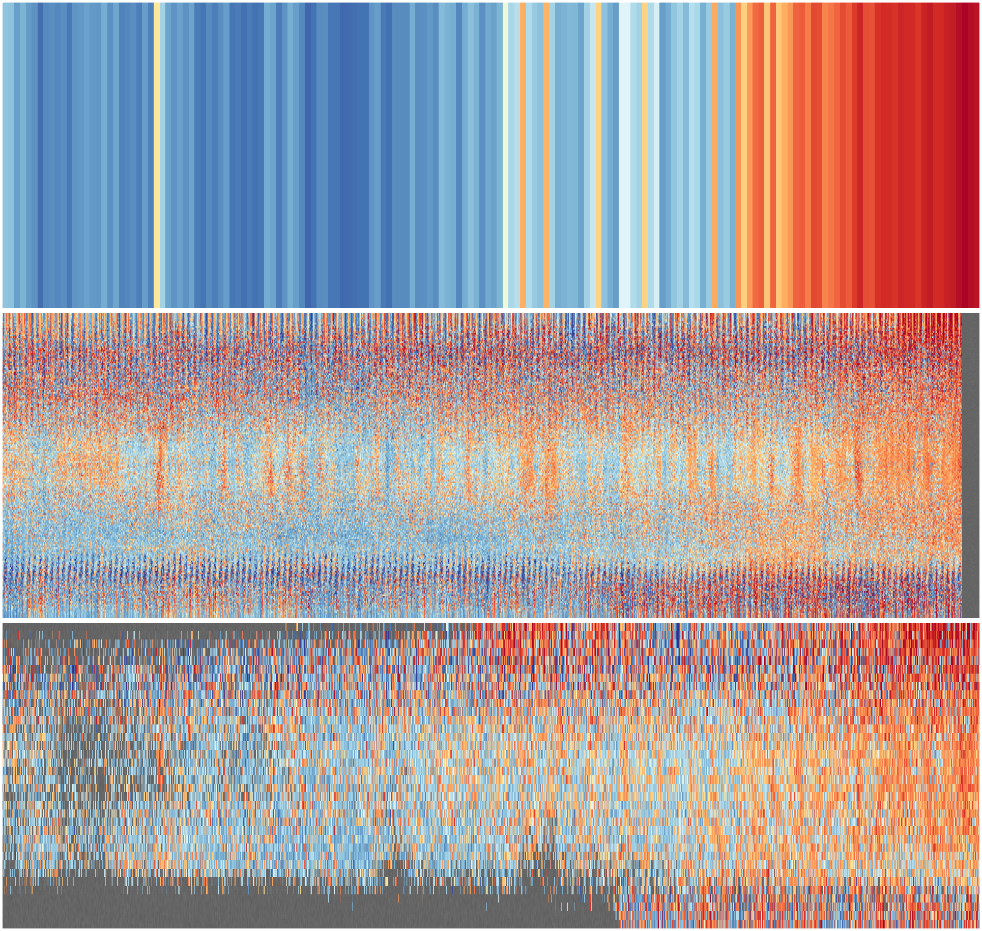
#!/usr/bin/env python

# Make an extended climate-stripes image from Eustace
# Monthly, resolved in latitude, sampling in longitude,
#   sampling across the ensemble.

# Delegates making the slices to the parallelisable make_slice script.
# This script only does the plotting.

import os
import numpy
import datetime
import pickle

import matplotlib
from matplotlib.backends.backend_agg import FigureCanvasAgg as FigureCanvas
from matplotlib.figure import Figure
from matplotlib.patches import Rectangle
from matplotlib.lines import Line2D

start=datetime.datetime(1851,1,1,0,0)
end=datetime.datetime(2018,12,31,23,59)

from get_sample import get_sample_cube

(ndata,dts) = get_sample_cube(start,end)

# Plot the resulting array as a 2d colourmap
fig=Figure(figsize=(19.2,6),              # Width, Height (inches)
           dpi=300,
           facecolor=(0.5,0.5,0.5,1),
           edgecolor=None,
           linewidth=0.0,
           frameon=False,
           subplotpars=None,
           tight_layout=None)
canvas=FigureCanvas(fig)
matplotlib.rc('image',aspect='auto')

def add_latline(ax,latitude):
    latl = (latitude+90)/180
    ax.add_line(Line2D([start.timestamp(),end.timestamp()],
                       [latl,latl],
                       linewidth=0.5,
                       color=(0.8,0.8,0.8,1),
                       zorder=200))

# Add a textured grey background
s=(2000,600)
ax2 = fig.add_axes([0,0.05,1,0.95],facecolor='green')
ax2.set_axis_off() # Don't want surrounding x and y axis
nd2=numpy.random.rand(s[1],s[0])
clrs=[]
for shade in numpy.linspace(.42+.01,.36+.01):
    clrs.append((shade,shade,shade,1))
y = numpy.linspace(0,1,s[1])
x = numpy.linspace(0,1,s[0])
img = ax2.pcolormesh(x,y,nd2,
                        cmap=matplotlib.colors.ListedColormap(clrs),
                        alpha=1.0,
                        shading='gouraud',
                        zorder=10)

# Plot the stripes
ax = fig.add_axes([0,0.05,1,0.95],facecolor='black',
                  xlim=((start+datetime.timedelta(days=1)).timestamp(),
                        (end-datetime.timedelta(days=1)).timestamp()),
                  ylim=(0,1))
ax.set_axis_off()

ndata = numpy.transpose(ndata)
s=ndata.shape
y = numpy.linspace(0,1,s[0]+1)
x = [(a-datetime.timedelta(days=15)).timestamp() for a in dts]
x.append((dts[-1]+datetime.timedelta(days=15)).timestamp())
img = ax.pcolorfast(x,y,numpy.cbrt(ndata),
                        cmap='RdYlBu_r',
                        alpha=1.0,
                        vmin=-1.7,
                        vmax=1.7,
                        zorder=100)

for lat in [-60,-30,0,30,60]:
    add_latline(ax,lat)

# Add a date grid
axg = fig.add_axes([0,0,1,1],facecolor='green',
                  xlim=((start+datetime.timedelta(days=1)).timestamp(),
                        (end-datetime.timedelta(days=1)).timestamp()),
                  ylim=(0,1))
axg.set_axis_off()
def add_dateline(ax,year):
    x = datetime.datetime(year,1,1,0,0).timestamp()
    ax.add_line(Line2D([x,x], [0.04,1.0],
                linewidth=0.5,
                color=(0.8,0.8,0.8,1),
                       zorder=200))
    ax.text(x,0.025,
         "%04d" % year,
         horizontalalignment='center',
         verticalalignment='center',
         color='black',
         size=14,
         clip_on=True,
         zorder=200)

for year in range(1860,2020,10):
    add_dateline(axg,year)

fig.savefig('ensemble.png')