Storm Darragh drawn with the Shipping Forecast
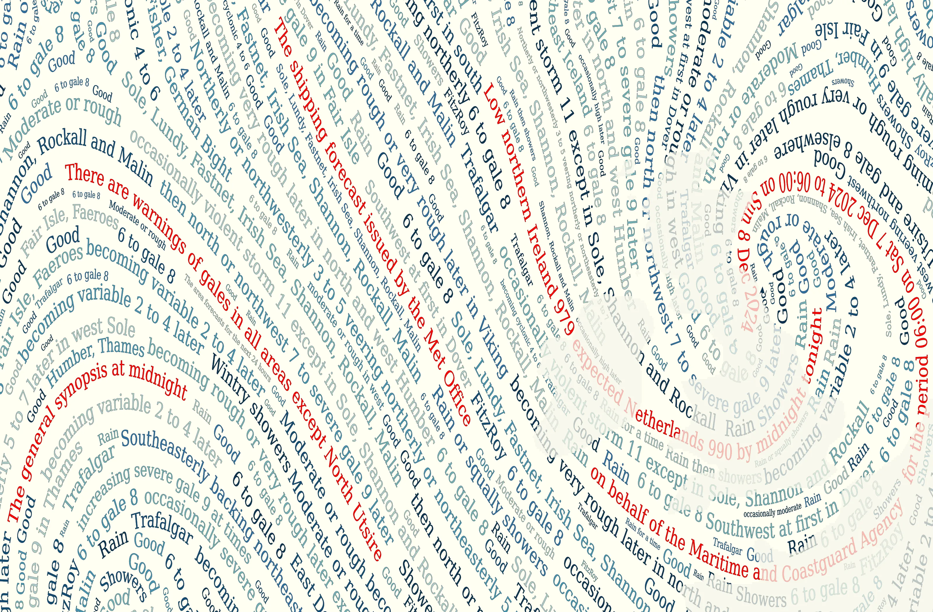
I’m no mariner, but - like so many people - I love the Shipping Forecast (read or listen to today’s). It’s justly famous for rhythm, cadence, and the poetry of its names, but it’s really a picture of the weather around the British Isles. Can we make that picture - a weather map - from the words of the Shipping Forecast? It’s a timely project, as the centenary of the first broadcast of the shipping forecast is Jan 1st 2025 (next week, as I write this) - also, I need a picture to decorate my new laptop.
Setup
I’m going to make the map using python and matplotlib. Step one is to set up a conda environment with the necessary packages:
name: ww
channels:
  - conda-forge
dependencies:
  # Basics
  - python=3.11
  - iris=3.6
  - nco=5.3  # Need ncks to fix broken CDS files
  # Older matplotlib - 3.10 screws up pcolorfast and background colour (why?)
  - matplotlib=3.9.2
  # Security patch
  - libwebp>=1.3.2
  # Code formatter
  - black
  # Documentation generator
  - sphinx=7.1
# Get data from ERA5
# You'll need to register, see https://cds.climate.copernicus.eu/api-how-to
  - cdsapi>=0.7.2
Getting the forecast
Generally, the worse the weather the better it looks when presented as a map - and the more dramatic the words of the forecast. So I chose the forecast for the recent Storm Darragh (7th December 2024) as my source. I split it into short lines - partly to emphasise the phrasing, and partly because long lines won’t fit on the plot.
We also need a reconstruction of the weather at the time of the forecast. I used the ERA5 reanalysis for this. I retrieved near-surface winds (and a land mask) from the Copernicus Climate Data Store (CDS).
#!/usr/bin/env python

# Retrieve surface weather variables from ERA5
#  for one hour.

import cdsapi

dataset = "reanalysis-era5-single-levels"
request = {
    "product_type": ["reanalysis"],
    "variable": ["10m_u_component_of_wind", "10m_v_component_of_wind", "land_sea_mask"],
    "year": ["2024"],
    "month": ["12"],
    "day": ["7"],
    "time": ["06:00"],
    "data_format": "netcdf",
    "download_format": "unarchived",
}
client = cdsapi.Client()
client.retrieve(dataset, request, "Wind_2024120706.nc")
The CDS is awesome - but its current version does terrible things to the netCDF files it makes. So we need to hack them a bit to make them useable:
#!/bin/bash

# Make the ERA5 .nc files iris-compatible
#  That is, delete the 'expver' variable

ncks -C -x -v expver Wind_2024120706.nc Wind_2024120706_no_expver.nc
Making the image
So we have the words of the shipping forecast, and the wind fields for the time of the forecast. We now want to draw a picture of the wind fields, using the words. The basic process is:
Identify a set of points (lat,lon) evenly spaced over the region of the plot. (I used the scipy PoissonDisk function)
For each point, use the wind fields to advect a line along the path of the wind.
For each such line, pick a phrase from the forecast, and render it along the advected path. (I used matplotlib’s TextPath)
We need to make sure that the phrases are legible, and that they don’t overlap. To do this I chose way too many starting points, and then used each in turn - discarding any that would overlap with existing phrases.
And then of course, there’s the difficult bit - what colours should we use to draw the phrases? I took an idea from the excellent MetBrewer and pinched a set of blue shades from Katsushika Hokusai. To which I added red as a highlight colour.
This document is licensed under CC BY 4.0. All code included is licensed under the terms of the BSD licence.
Note that the forecast text is Crown Copyright, and the ERA5 data used is licensed by Copernicus