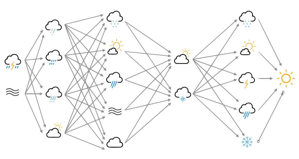
A deep autoencoder
Again inspired by Vikram Tiwari’s tf.keras Autoencoder page, we can try a deep autoencoder - with four hidden layers. This is fundamentally the same as the simple autoencoder, except that it has more hidden layers (also, I’ve switched to Leaky-ReLU activations as they showed the best combination of performance and speed in activation tests).
#!/usr/bin/env python

# Deep autoencoder for 20CR prmsl fields.

import os
import tensorflow as tf
import ML_Utilities
import pickle

# How many epochs to train for
n_epochs=100

# Create TensorFlow Dataset object from the prepared training data
(tr_data,n_steps) = ML_Utilities.dataset(purpose='training',
                                         source='20CR2c',
                                         variable='prmsl')
tr_data = tr_data.repeat(n_epochs)

# Need to reshape the data to linear, and produce a tuple
#  (source,target) for model
def to_model(ict):
   ict=tf.reshape(ict,[1,91*180])
   return(ict,ict)
tr_data = tr_data.map(to_model)

# Similar dataset from the prepared test data
(tr_test,test_steps) = ML_Utilities.dataset(purpose='test',
                                            source='20CR2c',
                                            variable='prmsl')
tr_test = tr_test.repeat(n_epochs)
tr_test = tr_test.map(to_model)

# Input placeholder - treat data as 1d
original = tf.keras.layers.Input(shape=(91*180,))
# Encoding layers
encoded = tf.keras.layers.Dense(128)(original)
encoded = tf.keras.layers.LeakyReLU()(encoded)
encoded = tf.keras.layers.Dense(64)(encoded)
encoded = tf.keras.layers.LeakyReLU()(encoded)
encoded = tf.keras.layers.Dense(32)(encoded)
encoded = tf.keras.layers.LeakyReLU()(encoded)
decoded = tf.keras.layers.Dense(64)(encoded)
decoded = tf.keras.layers.LeakyReLU()(decoded)
decoded = tf.keras.layers.Dense(128)(decoded)
# Output layer - same shape as input
decoded = tf.keras.layers.Dense(91*180)(decoded)

# Model relating original to output
autoencoder = tf.keras.models.Model(original, decoded)
# Choose a loss metric to minimise (RMS)
#  and an optimiser to use (adadelta)
autoencoder.compile(optimizer='adadelta', loss='mean_squared_error')

# Train the autoencoder
history=autoencoder.fit(x=tr_data,
                epochs=n_epochs,
                steps_per_epoch=n_steps,
                validation_data=tr_test,
                validation_steps=test_steps,
                verbose=2) # One line per epoch

# Save the model
save_file=("%s/Machine-Learning-experiments/"+
           "deep_autoencoder/"+
           "saved_models/Epoch_%04d") % (
                 os.getenv('SCRATCH'),n_epochs)
if not os.path.isdir(os.path.dirname(save_file)):
    os.makedirs(os.path.dirname(save_file))
tf.keras.models.save_model(autoencoder,save_file)
history_file=("%s/Machine-Learning-experiments/"+
              "deep_autoencoder/"+
              "saved_models/history_to_%04d.pkl") % (
                 os.getenv('SCRATCH'),n_epochs)
pickle.dump(history.history, open(history_file, "wb"))
It’s several times slower than the simple autoencoder, and seems to be only slightly improved in quality.
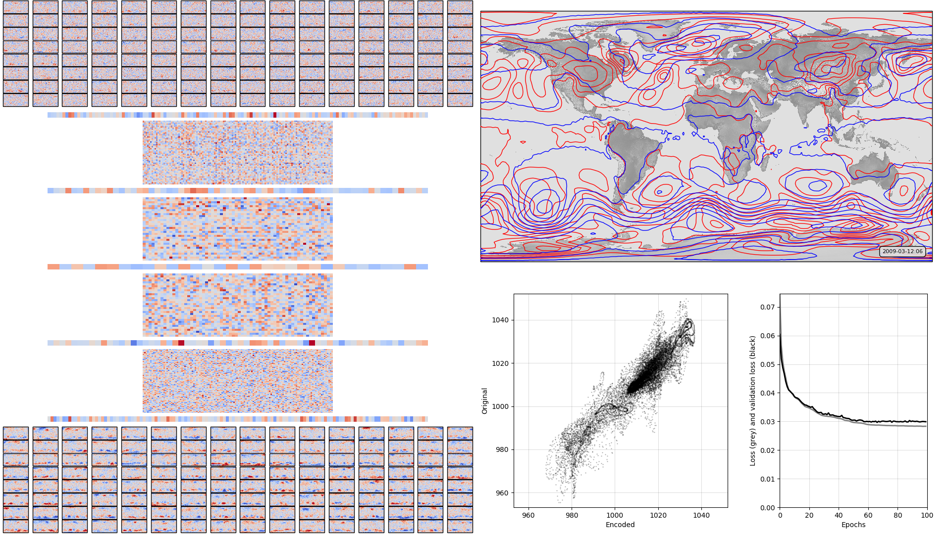
On the left, the model weights: layer-by-layer from input to output - the layers alternate between fully-connected layers and leaky-relu activation layers Top right, a sample pressure field: Original in red, after passing through the autoencoder in blue. Bottom right, , a scatterplot of original v. encoded pressures for the sample field, and a graph of training progress: Loss v. no. of training epochs.
Apart from the input and output layers, I don’t know how to read the weights colourmaps for the deep autoencoder - plots like this may not be much use.
Script to make the figure
#!/usr/bin/env python

# General model quality plot
# Deep autoencoder version

import tensorflow as tf
tf.enable_eager_execution()
import numpy

import IRData.twcr as twcr
import iris
import datetime
import argparse
import os
import math
import pickle

import Meteorographica as mg

import matplotlib
from matplotlib.backends.backend_agg import FigureCanvasAgg as FigureCanvas
from matplotlib.figure import Figure
import cartopy
import cartopy.crs as ccrs

# Get the 20CR data
ic=twcr.load('prmsl',datetime.datetime(2009,3,12,6),
                           version='2c')
ic=ic.extract(iris.Constraint(member=1))

# Get the autoencoder
model_save_file=("%s/Machine-Learning-experiments/"+
                  "deep_autoencoder/"+
                  "saved_models/Epoch_%04d") % (
                     os.getenv('SCRATCH'),100)
autoencoder=tf.keras.models.load_model(model_save_file)
# Get the order of the hidden weights - most to least important
order=numpy.argsort(numpy.abs(autoencoder.get_weights()[1]))[::-1]

# Calculate the mean and sd of the weights across the layers
#  so we cal plot them on a consistent colour scale
#fw=autoencoder.get_weights()[0].flatten()
#fw *= len(fw)
#for layer in range(1,11):
#   w = autoencoder.get_weights()[layer].flatten()
#   w *= len(w)
#   fw = numpy.concatenate((fw,w))
#vmin=numpy.mean(fw)-numpy.std(fw)*3
#vmax=numpy.mean(fw)+numpy.std(fw)*3
#vmin=-5
#vmax=5


# Normalisation - Pa to mean=0, sd=1 - and back
def normalise(x):
   x -= 101325
   x /= 3000
   return x

def unnormalise(x):
   x *= 3000
   x += 101325
   return x

fig=Figure(figsize=(19.2,10.8),  # 1920x1080, HD
           dpi=100,
           facecolor=(0.88,0.88,0.88,1),
           edgecolor=None,
           linewidth=0.0,
           frameon=False,
           subplotpars=None,
           tight_layout=None)
canvas=FigureCanvas(fig)

# Top right - map showing original and reconstructed fields
projection=ccrs.RotatedPole(pole_longitude=180.0, pole_latitude=90.0)
ax_map=fig.add_axes([0.505,0.51,0.475,0.47],projection=projection)
ax_map.set_axis_off()
extent=[-180,180,-90,90]
ax_map.set_extent(extent, crs=projection)
matplotlib.rc('image',aspect='auto')

# Run the data through the autoencoder and convert back to iris cube
pm=ic.copy()
pm.data=normalise(pm.data)
ict=tf.convert_to_tensor(pm.data, numpy.float32)
ict=tf.reshape(ict,[1,91*180]) # ????
result=autoencoder.predict_on_batch(ict)
result=tf.reshape(result,[91,180])
pm.data=unnormalise(result)

# Background, grid and land
ax_map.background_patch.set_facecolor((0.88,0.88,0.88,1))
#mg.background.add_grid(ax_map)
land_img_orig=ax_map.background_img(name='GreyT', resolution='low')

# original pressures as red contours
mg.pressure.plot(ax_map,ic,
                 scale=0.01,
                 resolution=0.25,
                 levels=numpy.arange(870,1050,7),
                 colors='red',
                 label=False,
                 linewidths=1)
# Encoded pressures as blue contours
mg.pressure.plot(ax_map,pm,
                 scale=0.01,
                 resolution=0.25,
                 levels=numpy.arange(870,1050,7),
                 colors='blue',
                 label=False,
                 linewidths=1)

mg.utils.plot_label(ax_map,
                    '%04d-%02d-%02d:%02d' % (2009,3,12,6),
                    facecolor=(0.88,0.88,0.88,0.9),
                    fontsize=8,
                    x_fraction=0.98,
                    y_fraction=0.03,
                    verticalalignment='bottom',
                    horizontalalignment='right')

def plot_input_weights():
  # Set the axes location
    base=[0.0,0.8,0.5,0.2]
    nrows=8
    ncolumns=16
    w_in=ic.copy()
    w_l=autoencoder.get_weights()[0]
    #w_l *= 128 # len(w_l.flatten())
    vmin=numpy.mean(w_l)-numpy.std(w_l)*3
    vmax=numpy.mean(w_l)+numpy.std(w_l)*3
    for channel in range(128):
        nr=channel//ncolumns
        nc=channel-ncolumns*nr
        nr=nrows-1-nr # Top down
        geom=[base[0]+(base[2]/ncolumns)*0.95*nc,
               base[1]+(base[3]/nrows)*0.95*nr,
               (base[2]/ncolumns)*0.95,
               (base[3]/nrows)*0.95]
        geom[0] += (0.05*base[2]/(ncolumns+1))*(nc+1)
        geom[1] += (0.05*base[3]/(nrows+1))*(nr+1)
        ax=fig.add_axes(geom,projection=projection)
        w_in.data=w_l[:,channel].reshape(ic.data.shape)
        lats = w_in.coord('latitude').points
        lons = w_in.coord('longitude').points-180
        prate_img=ax.pcolorfast(lons, lats, w_in.data,
                                cmap='coolwarm',
                                vmin=vmin,
                                vmax=vmax)

def plot_output_weights():
  # Set the axes location
    base=[0.0,0.002,0.5,0.2]
    nrows=8
    ncolumns=16
    w_in=ic.copy()
    w_l=autoencoder.get_weights()[10]
    #w_l *= 128 # len(w_l.flatten())
    vmin=numpy.mean(w_l)-numpy.std(w_l)*3
    vmax=numpy.mean(w_l)+numpy.std(w_l)*3
    for channel in range(128):
        nr=channel//ncolumns
        nc=channel-ncolumns*nr
        nr=nrows-1-nr # Top down
        geom=[base[0]+(base[2]/ncolumns)*0.95*nc,
              base[1]+(base[3]/nrows)*0.95*nr,
              (base[2]/ncolumns)*0.95,
              (base[3]/nrows)*0.95]
        geom[0] += (0.05*base[2]/(ncolumns+1))*(nc+1)
        geom[1] += (0.05*base[3]/(nrows+1))*(nr+1)
        ax=fig.add_axes(geom,projection=projection)
        w_in.data=w_l[channel,:].reshape(ic.data.shape)
        lats = w_in.coord('latitude').points
        lons = w_in.coord('longitude').points-180
        prate_img=ax.pcolorfast(lons, lats, w_in.data,
                                cmap='coolwarm',
                                vmin=vmin,
                                vmax=vmax)

def plot_weights_block(w_l,geom):
   vmin=numpy.mean(w_l)-numpy.std(w_l)*3
   vmax=numpy.mean(w_l)+numpy.std(w_l)*3
   #w_l *= len(w_l.flatten())
   ax=fig.add_axes(geom)
   ax.set_axis_off()
   if len(w_l.shape)==1:
      w_l=numpy.array([w_l,w_l])
   x_p=range(w_l.shape[0])
   ax.set_xlim(min(x_p),max(x_p))
   y_p=range(w_l.shape[1])
   ax.set_ylim(min(y_p)-0.5,max(y_p)+0.5)
   img=ax.pcolorfast(x_p,y_p,
                     w_l,
                     cmap='coolwarm',
                     vmin=vmin,
                     vmax=vmax)

plot_input_weights()
plot_weights_block(autoencoder.get_weights()[1],
                   [0.05,0.78,0.4,0.01])
plot_weights_block(autoencoder.get_weights()[2].transpose(),
                   [0.15,0.65375,0.2,0.12])
plot_weights_block(autoencoder.get_weights()[3],
                   [0.05,0.6375,0.4,0.01])
plot_weights_block(autoencoder.get_weights()[4].transpose(),
                   [0.15,0.5112,0.2,0.12])
plot_weights_block(autoencoder.get_weights()[5],
                   [0.05,0.495,0.4,0.01])
plot_weights_block(autoencoder.get_weights()[6],
                   [0.15,0.36875,0.2,0.12])
plot_weights_block(autoencoder.get_weights()[7],
                   [0.05,0.3525,0.4,0.01])
plot_weights_block(autoencoder.get_weights()[8],
                   [0.15,0.22625,0.2,0.12])
plot_weights_block(autoencoder.get_weights()[9],
                   [0.05,0.21,0.4,0.01])
plot_output_weights()

# Scatterplot of encoded v original
ax=fig.add_axes([0.54,0.05,0.225,0.4])
aspect=.225/.4*16/9
# Axes ranges from data
dmin=min(ic.data.min(),pm.data.min())
dmax=max(ic.data.max(),pm.data.max())
dmean=(dmin+dmax)/2
dmax=dmean+(dmax-dmean)*1.05
dmin=dmean-(dmean-dmin)*1.05
if aspect<1:
    ax.set_xlim(dmin/100,dmax/100)
    ax.set_ylim((dmean-(dmean-dmin)*aspect)/100,
                (dmean+(dmax-dmean)*aspect)/100)
else:
    ax.set_ylim(dmin/100,dmax/100)
    ax.set_xlim((dmean-(dmean-dmin)*aspect)/100,
                (dmean+(dmax-dmean)*aspect)/100)
ax.scatter(x=pm.data.flatten()/100,
           y=ic.data.flatten()/100,
           c='black',
           alpha=0.25,
           marker='.',
           s=2)
ax.set(ylabel='Original',
       xlabel='Encoded')
ax.grid(color='black',
        alpha=0.2,
        linestyle='-',
        linewidth=0.5)


# Plot the training history
history_save_file=("%s/Machine-Learning-experiments/"+
                   "deep_autoencoder/"+
                   "saved_models/history_to_%04d.pkl") % (
                      os.getenv('SCRATCH'),100)
history=pickle.load( open( history_save_file, "rb" ) )
ax=fig.add_axes([0.82,0.05,0.155,0.4])
# Axes ranges from data
ax.set_xlim(0,len(history['loss']))
ax.set_ylim(0,numpy.max(numpy.concatenate((history['loss'],
                                           history['val_loss']))))
ax.set(xlabel='Epochs',
       ylabel='Loss (grey) and validation loss (black)')
ax.grid(color='black',
        alpha=0.2,
        linestyle='-',
        linewidth=0.5)
ax.plot(range(len(history['loss'])),
        history['loss'],
        color='grey',
        linestyle='-',
        linewidth=2)
ax.plot(range(len(history['val_loss'])),
        history['val_loss'],
        color='black',
        linestyle='-',
        linewidth=2)


# Render the figure as a png
fig.savefig("comparison_full.png")