
Uncertainty and observations
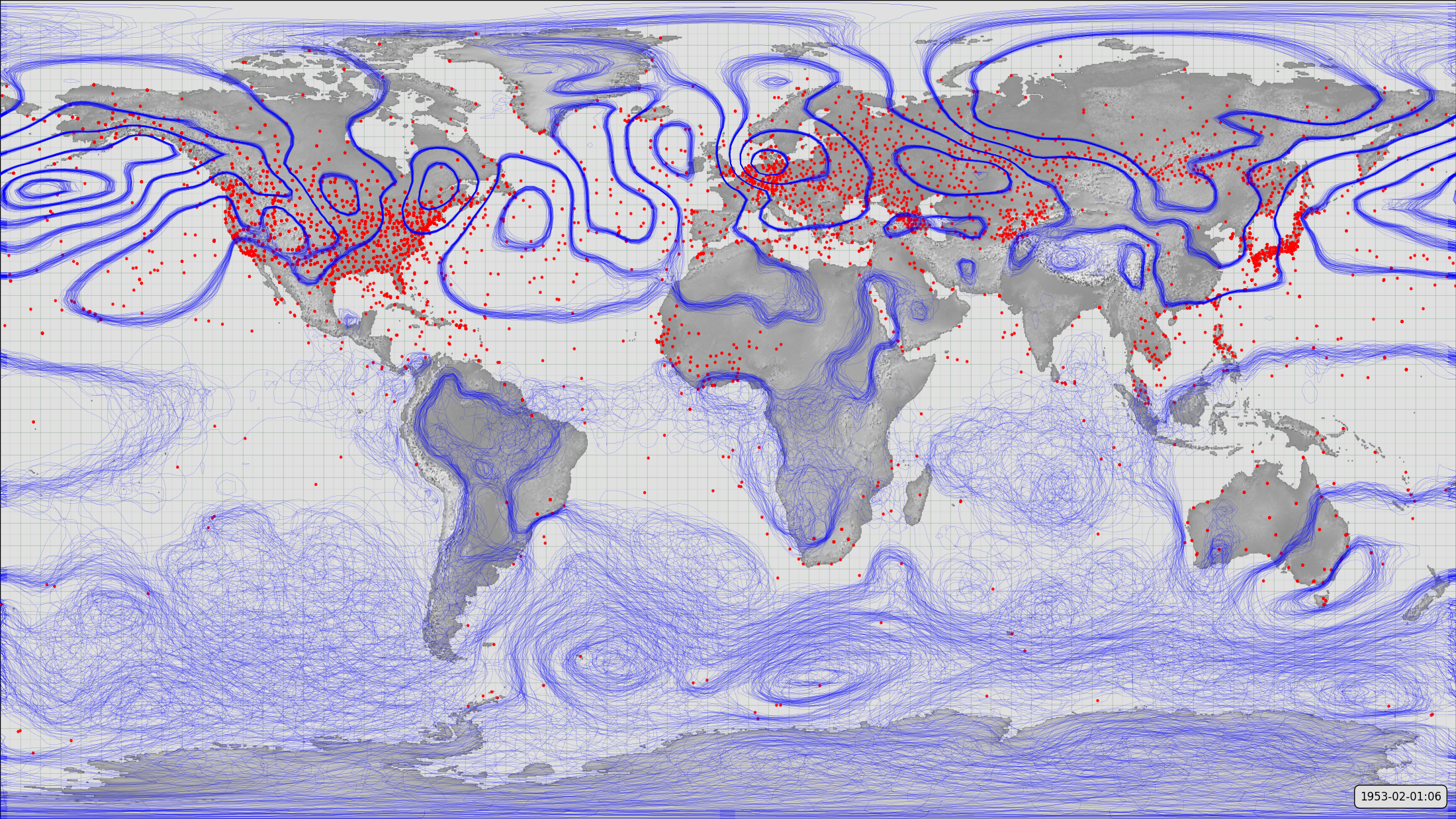
Observations coverage and reconstructed weather (MSLP) uncertainty.
The red dots mark the observations asimilated at the selected time-point (1953-02-01:06) - 6-hours worth of observations. The blue contours form a spaghetti-contour plot - 56 contour plots (one for each 20CR ensemble member) all plotted on top of one another. Where the ensemble spread is small all 56 contour plots are almost the same - this produces the clean contours in the northern extratropics. Where the ensemble spread is large the contours can be in quite different places in the different ensemble plots - producing the messy effect visible in the south-east Pacific. The overall effect is to show both the reconstructed pressure field and its uncertainty.
Code to make the figure
Download the data required:
import datetime
import IRData.twcr as twcr

dte=datetime.datetime(1953,2,1)
twcr.fetch('prmsl',dte,version='2c')
twcr.fetch_observations(dte,version='2c')
Script to make the figure:
# Meteorographica example script

# Pressure spaghetti plot and underlying observations

import Meteorographica as mg
import IRData.twcr as twcr
import datetime

import matplotlib
from matplotlib.backends.backend_agg import FigureCanvasAgg as FigureCanvas
from matplotlib.figure import Figure
import cartopy
import cartopy.crs as ccrs

# Date=time for plot
dte=datetime.datetime(1953,2,1,6,0)

# Define the figure (page size, background color, resolution, ...
aspect=16/9.0
fig=Figure(figsize=(22,22/aspect),              # Width, Height (inches)
           dpi=100,
           facecolor=(0.88,0.88,0.88,1),
           edgecolor=None,
           linewidth=0.0,
           frameon=False,                # Don't draw a frame
           subplotpars=None,
           tight_layout=None)
# Attach a canvas
canvas=FigureCanvas(fig)

projection=ccrs.RotatedPole(pole_longitude=180.0,
                                pole_latitude=90.0,
                                central_rotated_longitude=0.0)

# Define an axes to contain the plot. In this case our axes covers
#  the whole figure
ax = fig.add_axes([0,0,1,1],projection=projection)
ax.set_axis_off() # Don't want surrounding x and y axis
# Set the axes background colour
ax.background_patch.set_facecolor((0.88,0.88,0.88,1))

# Lat and lon range (in rotated-pole coordinates) for plot
extent=[-180.0,180.0,-90.0,90.0]
ax.set_extent(extent, crs=projection)
# Lat:Lon aspect does not match the plot aspect, ignore this and
#  fill the figure with the plot.
matplotlib.rc('image',aspect='auto')

# Draw a lat:lon grid
mg.background.add_grid(ax,
                       sep_major=5,
                       sep_minor=2.5,
                       color=(0,0.3,0,0.2))


# Add the land
land_img=ax.background_img(name='GreyT', resolution='low')

# Plot pressure ensemble
prmsl=twcr.load('prmsl',dte,version='2c')
mg.pressure.plot(ax,prmsl,resolution=0.25,
                    scale=0.01,type='spaghetti')

# Plot obs
obs=twcr.load_observations_fortime(dte,version='2c')
mg.observations.plot(ax,obs,radius=0.25,
                            edgecolor='red',
                            facecolor='red')


# Add a label showing the date
mg.utils.plot_label(ax,
                    ('%04d-%02d-%02d:%02d' %
                    (dte.year,dte.month,dte.day,dte.hour)),
                    x_fraction=0.99,
                    facecolor=fig.get_facecolor())

# Render the figure as a png
fig.savefig('pressure_uncertainty.png')