Warming Stripes (20CRv3 version)
Note
This idea has been developed into the generalised Stripes .
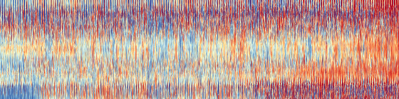
The warming stripes are a spectacularly successful tool for communicating climate change - can we build on them by making more complex versions containing more information? In particular, I’d like to make an equivalent plot that used temperatures resolved in time and space - this would show the large-scale change in the context of smaller-scale variability, much closer to climate change as we experience it.
Hourly data proved a bit much, but we can go to monthly: The vertical axis of this plot is latitude (90S to 90N at 1 degree resolution), the horizontal axis is time (Jan 1836 to Dec 2015, at 1 month resolution), each vertical line is at a randomly sampled 1-degree of longitude. Colour gives temperature anomaly (w.r.t 1900-1950 climatology). Data are from 20CR version 3.
Note that, unlike the original warming stripes, this visualization says more about the uncertainties and biases in the data set construction than about actual climate.
Code to make the poster
Download the data file (netCDF) from the 20CRv3 website (direct link).
Script to plot the poster:
#!/usr/bin/env python

# Make a poster showing 20CR monthly temperatures.
# Inspired by the climate stripes popularised by Ed Hawkins.

import os
import iris
#import geohash2
import numpy
import datetime

import matplotlib
from matplotlib.backends.backend_agg import FigureCanvasAgg as FigureCanvas
from matplotlib.figure import Figure
from matplotlib.patches import Rectangle

from pandas import qcut

# Load the 20CR data
h=iris.load_cube('./air.2m.mon.mean.nc','air_temperature')
# Get the climatology
n=[]
for m in range(1,13):
    mc=iris.Constraint(time=lambda cell: cell.point.month == m and cell.point.year>1960 and cell.point.year<1991)
    n.append(h.extract(mc).collapsed('time', iris.analysis.MEAN))

# Anomalise
for tidx in range(len(h.coord('time').points)):
    tpt=datetime.datetime(1800,1,1)+datetime.timedelta(hours=h.coord('time').points[tidx])
    midx=tpt.month-1
    h.data[tidx,:,:] -= n[midx].data

# Average over longitude
#h=h.collapsed('longitude', iris.analysis.MEAN)
p=h.extract(iris.Constraint(longitude=0))
s=h.data.shape
for t in range(s[0]):
    for lat in range(s[1]):
        rand_l = numpy.random.randint(0,s[2])
        p.data[t,lat]=h.data[t,lat,rand_l]
h=p
ndata=h.data

# Plot the resulting array as a 2d colourmap
fig=Figure(figsize=(72,18),              # Width, Height (inches)
           dpi=300,
           facecolor=(0.5,0.5,0.5,1),
           edgecolor=None,
           linewidth=0.0,
           frameon=False,                # Don't draw a frame
           subplotpars=None,
           tight_layout=None)
#fig.set_frameon(False)
# Attach a canvas
canvas=FigureCanvas(fig)
matplotlib.rc('image',aspect='auto')
ax = fig.add_axes([0,0,1,1],facecolor='black',xlim=(0,1),ylim=(0,1))
ax.set_axis_off() # Don't want surrounding x and y axis
# Axes ignores facecolor, so set background explicitly
#ax.add_patch(Rectangle((0,0),1,1,facecolor=(0.88,0.88,0.88,1),fill=True,zorder=1))

# Nomalise by latitude
#s=ndata.shape
#for lat in range(s[1]):
#   qn=qcut(ndata[:,lat],100,labels=False,duplicates='drop')
#   ndata[:,lat]=qn

ndata=numpy.transpose(ndata)
s=ndata.shape
#ndata=qcut(ndata.flatten(),200,labels=False,
#                             duplicates='drop').reshape(s),
y = numpy.linspace(0,1,s[0])
x = numpy.linspace(0,1,s[1])
img = ax.pcolorfast(x,y,numpy.cbrt(ndata),
                        cmap='RdYlBu_r',
                        alpha=1.0,
                        vmin=-1.7,
                        vmax=1.7,
                        zorder=100)

fig.savefig('20CR.pdf')
#RdYlBu_r