Spaghetti contours
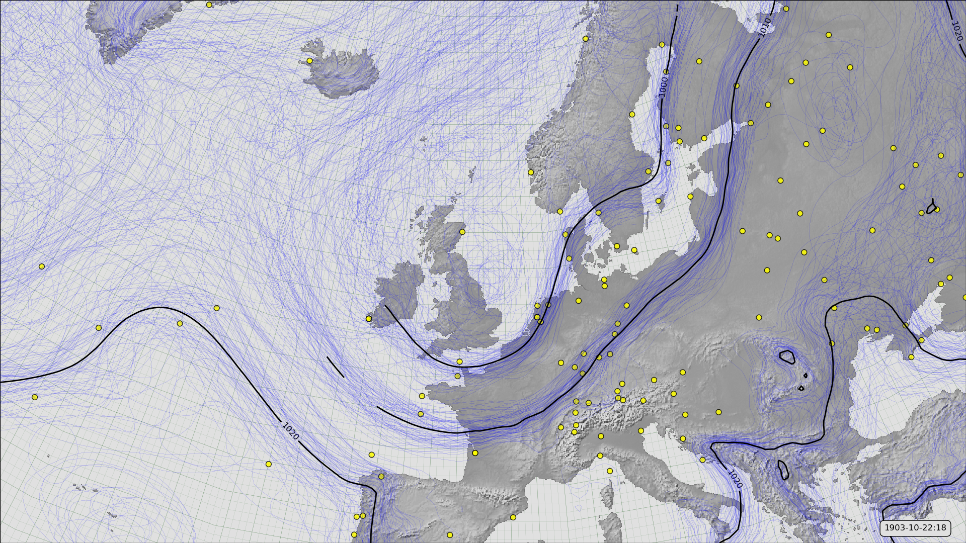
MSLP contours from 20CRv3 for October 22nd, 1903 (at 6pm), and observations assimilated.
This style of figure shows not only the best-estimate MSLP field (black contours), but also the uncertainty in that field. The blue lines are contours of MSLP for each of the 80 ensemble menbers in 20CRv3. Where the uncertainty is low these will cluster together (around the corresponding black contour) - where the blue contours diverge the uncertainty in the field is large.
The yellow dots show the observations assimilated into this field. It’s the observations density that controls the quality of the field - more observations mean a lower uncertainty. (Though note that observations from earlier times (not shown) also matter).
Code to make the figure
Collect the data (prmsl ensemble and observations from 20CR2c for 1903):
#!/usr/bin/env python

import IRData.twcr as twcr
import datetime

dte=datetime.datetime(1903,10,1)
for version in (['4.5.1']):
    twcr.fetch('prmsl',dte,version=version)
    twcr.fetch_observations(dte,version=version)
Script to make the figure:
#!/usr/bin/env python

# UK region mslp spaghetti contours for 20CRv3

import math
import datetime
import numpy
import pandas

import iris
import iris.analysis

import matplotlib
from matplotlib.backends.backend_agg import \
             FigureCanvasAgg as FigureCanvas
from matplotlib.figure import Figure

import cartopy
import cartopy.crs as ccrs

import Meteorographica as mg
import IRData.twcr as twcr

# Date to show
year=1903
month=10
day=22
hour=18
dte=datetime.datetime(year,month,day,hour)

# Landscape page
aspect=16.0/9
fig=Figure(figsize=(10.8*aspect,10.8),  # Width, Height (inches)
           dpi=100,
           facecolor=(0.88,0.88,0.88,1),
           edgecolor=None,
           linewidth=0.0,
           frameon=False,
           subplotpars=None,
           tight_layout=None)
canvas=FigureCanvas(fig)

# UK-centred projection
projection=ccrs.RotatedPole(pole_longitude=180, pole_latitude=35)
scale=15
extent=[scale*-1*aspect,scale*aspect,scale*-1,scale]

# Single plot filling figure
ax=fig.add_axes([0.0,0.0,1.0,1.0],projection=projection)
ax.set_axis_off()
ax.set_extent(extent, crs=projection)

# Background, grid and land
ax.background_patch.set_facecolor((0.88,0.88,0.88,1))
mg.background.add_grid(ax)
land_img=ax.background_img(name='GreyT', resolution='low')

# Add the observations
obs=twcr.load_observations_fortime(dte,version='4.5.1')
mg.observations.plot(ax,obs,radius=0.15)

# load the pressures
prmsl=twcr.load('prmsl',dte,version='4.5.1')

# Contour spaghetti plot of ensemble members
mg.pressure.plot(ax,prmsl,scale=0.01,type='spaghetti',
                   resolution=0.25,
                   levels=numpy.arange(870,1050,10),
                   colors='blue',
                   label=False,
                   linewidths=0.1)

# Add the ensemble mean - with labels
prmsl_m=prmsl.collapsed('member', iris.analysis.MEAN)
prmsl_s=prmsl.collapsed('member', iris.analysis.STD_DEV)
# Mask out mean where uncertainties large
prmsl_m.data[numpy.where(prmsl_s.data>300)]=numpy.nan
mg.pressure.plot(ax,prmsl_m,scale=0.01,
                   resolution=0.25,
                   levels=numpy.arange(870,1050,10),
                   colors='black',
                   label=True,
                   linewidths=2)

# label
mg.utils.plot_label(ax,
              '%04d-%02d-%02d:%02d' % (year,month,day,hour),
              facecolor=fig.get_facecolor(),
              x_fraction=0.98,
              horizontalalignment='right')

# Output as png
fig.savefig('spaghetti_example_%04d%02d%02d%02d.png' %
                                  (year,month,day,hour))