Check normalization of ERA5 data
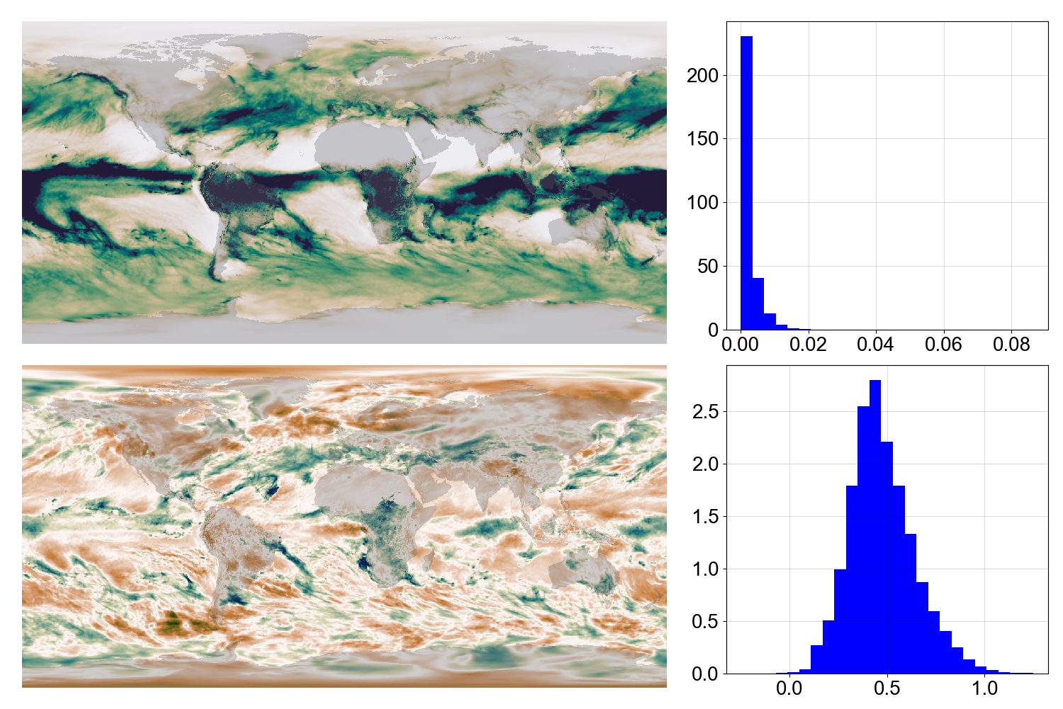
Raw precipitation (top) and normalized equivalent (bottom) for a March 1969.
If successful, the normalized data should be approximately normally distributed with mean=0.5 and standard deviation=0.2 (whatever the distribution of the input data is. The script plot_distribution_monthly.py compares normalized and original data (spatial distribution and histogram) for a month. (Takes –variable, –year, and –month as arguments.)
Script to make the plot:
#!/usr/bin/env python

# Plot raw and normalized variable for a selected month
# Map and distribution.

import os
import sys
import numpy as np

from utilities import plots, grids
from get_data.ERA5 import ERA5_monthly

from normalize import load_fitted, normalize_cube

import matplotlib
from matplotlib.backends.backend_agg import FigureCanvasAgg as FigureCanvas
from matplotlib.figure import Figure
from matplotlib.patches import Rectangle

import cmocean
import argparse

from scipy.stats import gamma

parser = argparse.ArgumentParser()
parser.add_argument(
    "--year", help="Year to plot", type=int, required=False, default=1969
)
parser.add_argument(
    "--month", help="Month to plot", type=int, required=False, default=3
)
parser.add_argument(
    "--variable",
    help="Name of variable to use (mean_sea_level_pressure, 2m_temperature, ...)",
    type=str,
    default="total_precipitation",
)
args = parser.parse_args()

# Load the fitted values
(shape, location, scale) = load_fitted(args.month, variable=args.variable)

# Load the raw data for the selected month
raw = ERA5_monthly.load(
    variable=args.variable,
    year=args.year,
    month=args.month,
    grid=grids.E5sCube,
)

# Make the normalized version
normalized = normalize_cube(raw, shape, location, scale)

# Make the plot
fig = Figure(
    figsize=(10 * 3 / 2, 10),
    dpi=100,
    facecolor=(0.5, 0.5, 0.5, 1),
    edgecolor=None,
    linewidth=0.0,
    frameon=False,
    subplotpars=None,
    tight_layout=None,
)
canvas = FigureCanvas(fig)
font = {
    "family": "sans-serif",
    "sans-serif": "DejaVu Sans",
    "weight": "normal",
    "size": 20,
}
matplotlib.rc("font", **font)
axb = fig.add_axes([0, 0, 1, 1])
axb.set_axis_off()
axb.add_patch(
    Rectangle(
        (0, 0),
        1,
        1,
        facecolor=(1.0, 1.0, 1.0, 1),
        fill=True,
        zorder=1,
    )
)

# choose actual and normalized data colour maps based on variable
cmaps = (cmocean.cm.balance, cmocean.cm.balance)
if args.variable == "total_precipitation":
    cmaps = (cmocean.cm.rain, cmocean.cm.tarn)
if args.variable == "mean_sea_level_pressure":
    cmaps = (cmocean.cm.diff, cmocean.cm.diff)


ax_raw = fig.add_axes([0.02, 0.515, 0.607, 0.455])
if args.variable == "total_precipitation":
    vMin = 0
else:
    vMin = np.percentile(raw.data.compressed(), 5)
plots.plotFieldAxes(
    ax_raw,
    raw,
    vMin=vMin,
    vMax=np.percentile(raw.data.compressed(), 95),
    cMap=cmaps[0],
)

ax_hist_raw = fig.add_axes([0.683, 0.535, 0.303, 0.435])
plots.plotHistAxes(ax_hist_raw, raw, bins=25)

ax_normalized = fig.add_axes([0.02, 0.03, 0.607, 0.455])
plots.plotFieldAxes(
    ax_normalized,
    normalized,
    vMin=-0.25,
    vMax=1.25,
    cMap=cmaps[1],
)

ax_hist_normalized = fig.add_axes([0.683, 0.05, 0.303, 0.435])
plots.plotHistAxes(ax_hist_normalized, normalized, vMin=-0.25, vMax=1.25, bins=25)


fig.savefig("monthly.webp")