Assimilating all the DWR observations
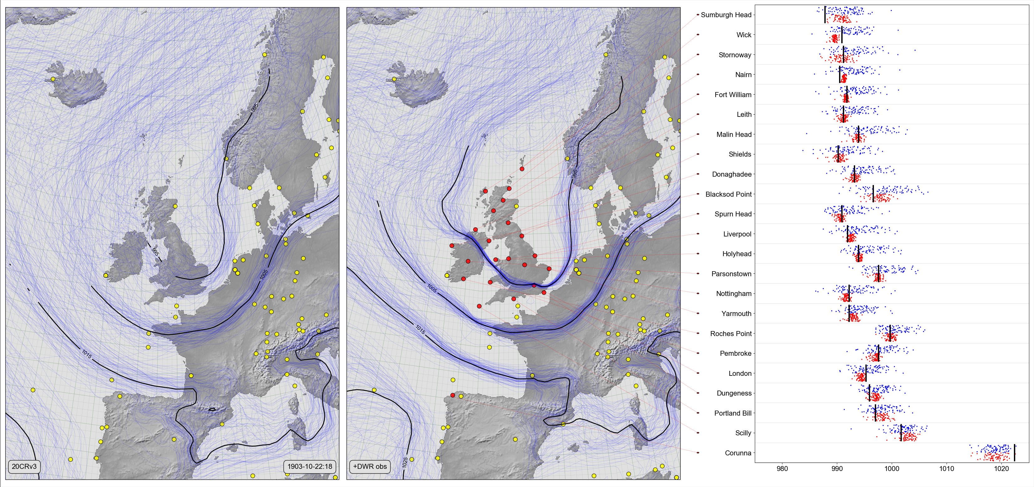
On the left, a Spaghetti-contour plot of 20CRv3 MSLP. Centre and right, Scatter-contour plot comparing the same field, after assimilating all 22 DWR observations for that date. The centre panel shows the 20CRv3 ensemble after assimilating all 22 station observations (red dots). The right panel compares the two ensembles with the new observations: Black lines show the observed pressures, blue dots the original 20CRv3 ensemble at the station locations, and red dots the 20CR ensemble after assimilating all the observations except the observation at that location.
Code to make the figure
Collect the reanalysis data (prmsl ensemble and observations from 20CRv3 for 1903):
#!/usr/bin/env python

import IRData.twcr as twcr
import datetime
dte=datetime.datetime(1903,10,22)
twcr.fetch('prmsl',dte,version='4.5.1')
twcr.fetch_observations(dte,version='4.5.1')
Script to make the figure:
#!/usr/bin/env python

# Assimilation of many stations.
# Validate at each station using the jacknife

import math
import datetime
import numpy
import pandas

import iris
import iris.analysis

import matplotlib
from matplotlib.backends.backend_agg import \
             FigureCanvasAgg as FigureCanvas
from matplotlib.figure import Figure
from matplotlib.patches import Circle

import cartopy
import cartopy.crs as ccrs

import Meteorographica as mg
import IRData.twcr as twcr

import DWR
import DIYA
import sklearn
RANDOM_SEED = 5

obs_error=5 # Pa
model=sklearn.linear_model.Lasso(normalize=True)

# Date to show
year=1903
month=10
day=22
hour=18
dte=datetime.datetime(year,month,day,hour)

# Landscape page
fig=Figure(figsize=(22*1.5,22/math.sqrt(2)),  # Width, Height (inches)
           dpi=100,
           facecolor=(0.88,0.88,0.88,1),
           edgecolor=None,
           linewidth=0.0,
           frameon=False,
           subplotpars=None,
           tight_layout=None)
canvas=FigureCanvas(fig)
font = {'family' : 'sans-serif',
        'sans-serif' : 'Arial',
        'weight' : 'normal',
        'size'   : 16}
matplotlib.rc('font', **font)

# UK-centred projection
projection=ccrs.RotatedPole(pole_longitude=177.5, pole_latitude=35.5)
scale=12
extent=[scale*-1,scale,scale*-1*math.sqrt(2),scale*math.sqrt(2)]

# On the left - spaghetti-contour plot of original 20CRv3
ax_left=fig.add_axes([0.005,0.01,0.323,0.98],projection=projection)
ax_left.set_axis_off()
ax_left.set_extent(extent, crs=projection)
ax_left.background_patch.set_facecolor((0.88,0.88,0.88,1))
mg.background.add_grid(ax_left)
land_img_left=ax_left.background_img(name='GreyT', resolution='low')

# 20CRv3 data
prmsl=twcr.load('prmsl',dte,version='4.5.1')

# 20CRv3 data
prmsl=twcr.load('prmsl',dte,version='4.5.1')
obs_t=twcr.load_observations_fortime(dte,version='4.5.1')
# Filter to those assimilated and near the UK
obs_s=obs_t.loc[((obs_t['Latitude']>0) &
                 (obs_t['Latitude']<90)) &
              ((obs_t['Longitude']>240) |
                 (obs_t['Longitude']<100))].copy()

# Plot the observations
mg.observations.plot(ax_left,obs_s,radius=0.15)

# PRMSL spaghetti plot
mg.pressure.plot(ax_left,prmsl,scale=0.01,type='spaghetti',
                   resolution=0.25,
                   levels=numpy.arange(875,1050,10),
                   colors='blue',
                   label=False,
                   linewidths=0.1)

# Add the ensemble mean - with labels
prmsl_m=prmsl.collapsed('member', iris.analysis.MEAN)
prmsl_s=prmsl.collapsed('member', iris.analysis.STD_DEV)
prmsl_m.data[numpy.where(prmsl_s.data>300)]=numpy.nan
mg.pressure.plot(ax_left,prmsl_m,scale=0.01,
                   resolution=0.25,
                   levels=numpy.arange(875,1050,10),
                   colors='black',
                   label=True,
                   linewidths=2)

mg.utils.plot_label(ax_left,
              '20CRv3',
              fontsize=16,
              facecolor=fig.get_facecolor(),
              x_fraction=0.02,
              horizontalalignment='left')

mg.utils.plot_label(ax_left,
              '%04d-%02d-%02d:%02d' % (year,month,day,hour),
              fontsize=16,
              facecolor=fig.get_facecolor(),
              x_fraction=0.98,
              horizontalalignment='right')

# In the centre - spaghetti-contour plot of 20CRv3 with DWR assimilated
ax_centre=fig.add_axes([0.335,0.01,0.323,0.98],projection=projection)
ax_centre.set_axis_off()
ax_centre.set_extent(extent, crs=projection)
ax_centre.background_patch.set_facecolor((0.88,0.88,0.88,1))
mg.background.add_grid(ax_centre)
land_img_centre=ax_centre.background_img(name='GreyT', resolution='low')

# Get the DWR observations for that afternoon
obs=DWR.load_observations('prmsl',
                          dte-datetime.timedelta(hours=0.1),
                          dte+datetime.timedelta(hours=0.1))

# Throw out the ones already used in 20CRv3
obs=obs[~obs['name'].isin(['ABERDEEN','VALENCIA','JERSEY'])]

obs_assimilate=obs # Use deep copy instead?
# Convert to normalised value same as reanalysis
obs_assimilate.value=obs_assimilate.value*100

# Update mslp by assimilating all obs.
prmsl2=DIYA.constrain_cube(prmsl,
                           lambda dte: twcr.load('prmsl',dte,version='4.5.1'),
                           obs=obs_assimilate,
                           obs_error=obs_error,
                           random_state=RANDOM_SEED,
                           model=model,
                           lat_range=(20,85),
                           lon_range=(280,60))

mg.observations.plot(ax_centre,obs_s,radius=0.15)
mg.observations.plot(ax_centre,obs_assimilate,
                     radius=0.15,facecolor='red',
                     lat_label='latitude',
                     lon_label='longitude')

# PRMSL spaghetti plot
mg.pressure.plot(ax_centre,prmsl2,scale=0.01,type='spaghetti',
                   resolution=0.25,
                   levels=numpy.arange(875,1050,10),
                   colors='blue',
                   label=False,
                   linewidths=0.1)

# Add the ensemble mean - with labels
prmsl_m=prmsl2.collapsed('member', iris.analysis.MEAN)
prmsl_s=prmsl2.collapsed('member', iris.analysis.STD_DEV)
prmsl_m.data[numpy.where(prmsl_s.data>300)]=numpy.nan
mg.pressure.plot(ax_centre,prmsl_m,scale=0.01,
                   resolution=0.25,
                   levels=numpy.arange(875,1050,10),
                   colors='black',
                   label=True,
                   linewidths=2)

mg.utils.plot_label(ax_centre,
              '+DWR obs',
              fontsize=16,
              facecolor=fig.get_facecolor(),
              x_fraction=0.02,
              horizontalalignment='left')


# Validation scatterplot on the right
stations=obs.name.values
ax_right=fig.add_axes([0.73,0.05,0.265,0.94])
# x-axis
xrange=[975,1025]
ax_right.set_xlim(xrange)
ax_right.set_xlabel('')

# y-axis
ax_right.set_ylim([1,len(stations)+1])
y_locations=[x+0.5 for x in range(1,len(stations)+1)]
ax_right.yaxis.set_major_locator(
              matplotlib.ticker.FixedLocator(y_locations))
ax_right.yaxis.set_major_formatter(
              matplotlib.ticker.FixedFormatter(
                  [DWR.pretty_name(s) for s in stations]))

# Custom grid spacing
for y in range(0,len(stations)):
    ax_right.add_line(matplotlib.lines.Line2D(
            xdata=xrange,
            ydata=(y+1,y+1),
            linestyle='solid',
            linewidth=0.2,
            color=(0.5,0.5,0.5,1),
            zorder=0))

latlon={}
for station in stations:
   latlon[station]=DWR.get_station_location(obs,station)

# Plot the station pressures
for y in range(0,len(stations)):
    station=stations[y]
    mslp=obs[obs.name==station].value.values[0]/100.0
    ax_right.add_line(matplotlib.lines.Line2D(
            xdata=(mslp,mslp), ydata=(y+1.1,y+1.9),
            linestyle='solid',
            linewidth=3,
            color=(0,0,0,1),
            zorder=1))

# for each station, plot the reanalysis ensemble at that station
interpolator = iris.analysis.Linear().interpolator(prmsl,
                                   ['latitude', 'longitude'])
for y in range(len(stations)):
    station=stations[y]
    ensemble=interpolator([latlon[station]['latitude'],
                           latlon[station]['longitude']])

    ax_right.scatter(ensemble.data/100.0,
                numpy.linspace(y+1.5,y+1.9,
                              num=len(ensemble.data)),
                25,
                'blue', # Color
                marker='.',
                edgecolors='face',
                linewidths=0.0,
                alpha=1.0,
                zorder=0.5)

# For each station, assimilate all but that station, and plot the resulting ensemble
for y in range(len(stations)):
    station=stations[y]
    obs_assimilate=obs[~obs['name'].isin([station])]
    prmsl2=DIYA.constrain_cube(prmsl,
                           lambda dte: twcr.load('prmsl',dte,version='4.5.1'),
                           obs=obs_assimilate,
                           obs_error=obs_error,
                           random_state=RANDOM_SEED,
                           model=model,
                           lat_range=(20,85),
                           lon_range=(280,60))
    interpolator = iris.analysis.Linear().interpolator(prmsl2,
                                   ['latitude', 'longitude'])
    ensemble=interpolator([latlon[station]['latitude'],
                           latlon[station]['longitude']])
    ax_right.scatter(ensemble.data/100.0,
                numpy.linspace(y+1.1,y+1.5,
                              num=len(ensemble.data)),
                25,
                'red', # Color
                marker='.',
                edgecolors='face',
                linewidths=0.0,
                alpha=1.0,
                zorder=0.5)

# Join each station name to its location on the map
# Need another axes, filling the whole fig
ax_full=fig.add_axes([0,0,1,1])
ax_full.patch.set_alpha(0.0)  # Transparent background

def pos_left(idx):
    station=stations[idx]
    ll=latlon[station]
    rp=ax_centre.projection.transform_points(ccrs.PlateCarree(),
                              numpy.asarray(ll['longitude']),
                              numpy.asarray(ll['latitude']))
    new_lon=rp[:,0]
    new_lat=rp[:,1]

    result={}
    aspect=math.sqrt(2)
    result['x']=0.335+0.323*((new_lon-(scale*-1))/(scale*2))
    result['y']=0.01+0.98*((new_lat-(scale*aspect*-1))/
                                       (scale*2*aspect))
    return result

# Label location of a station in ax_full coordinates
def pos_right(idx):
    result={}
    result['x']=0.675
    result['y']=0.05+(0.94/len(stations))*(idx+0.5)
    return result

for i in range(len(stations)):
    p_left=pos_left(i)
    p_right=pos_right(i)
    ax_full.add_patch(Circle((p_right['x'],
                              p_right['y']),
                             radius=0.001,
                             facecolor=(1,0,0,1),
                             edgecolor=(0,0,0,1),
                             alpha=1,
                             zorder=1))
    ax_full.add_line(matplotlib.lines.Line2D(
            xdata=(p_left['x'],p_right['x']),
            ydata=(p_left['y'],p_right['y']),
            linestyle='solid',
            linewidth=0.2,
            color=(1,0,0,1.0),
            zorder=1))

# Output as png
fig.savefig('Jacknife_%04d%02d%02d%02d.png' %
                                  (year,month,day,hour))